- Why Red Needs Discipline
- Red Saree Look Rule 6: Do Not Choose a Weak Blouse
- Red Saree Look Rule 7: Do Not Add Excess Colour
- Red Saree Look Rule 8: Do Not Over-Accessorize the Hair
- Red Saree Look Rule 9: Do Not Ignore Footwear Logic
- Red Saree Look Rule 10: Do Not Copy Bridal Styling Everywhere
- Red Saree Look Rule 11: Do Not Ignore Fabric and Occasion Alignment
- Red Saree Look Rule 12: Do Not Forget Body Proportion
- Red Saree Look Rule 13: Do Not Believe Age Myths About Red
- Final Philosophy: Red Is About Control
- Closing Note
Why Red Needs Discipline
The red saree is not forgiving. It magnifies mistakes, exaggerates excess, and exposes poor styling instantly. A look that works in beige or pastel collapses under red because red carries authority. It does not blend into the background. It dominates the frame. That is why red needs rules. This is not a guide about adding more elements to your red saree look. It is a discipline manual about editing.
If you’ve ever worn red and felt like something looked “too much” but couldn’t explain why, this guide is for you. Think of it as a styling filter. A rule book that protects elegance. Because for red less is more.
Red Saree Look Rule 1: Do Not Compete With the Saree
Red is already loud. Adding more drama does not make the look grand; it makes it chaotic. A heavy blouse paired with a heavy saree and heavy jewellery creates visual shouting. Sequins mixed with zari, glitter mixed with stones, and oversized jewellery layered together remove elegance completely.
What happens when everything is heavy
Heavy blouse, saree, jewellery, makeup, everything overdone. Nothing takes the lead, and everything screams. When every element tries to be the star, the outfit collapses into chaos.
The discipline rule
How to avoid it: Choose one hero element. If the saree is rich, tone down jewellery. If jewellery is bold, simplify the blouse. Red needs hierarchy.
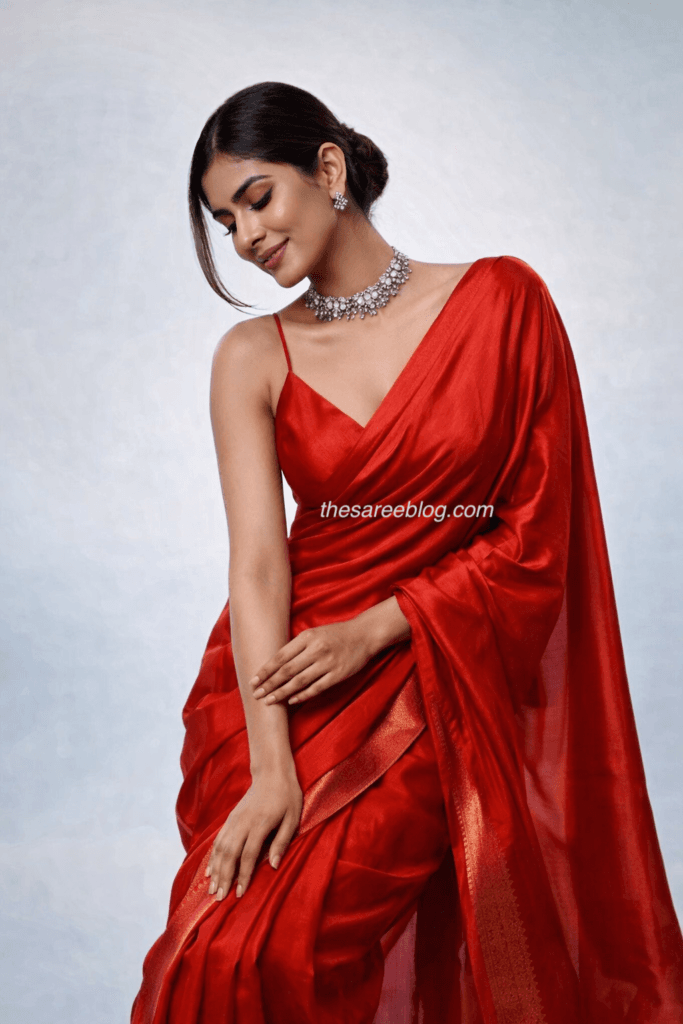
Red Saree Look Rule 2: Do Not Mix Too Many Reds
Not all reds are friends. Cherry red, wine red, scarlet, crimson — each has a different temperature. Slight mismatch between blouse and saree creates visual tension.When slightly mismatched reds appear in the saree, blouse, and lipstick, the look feels accidental instead of curated.
Why near-match is dangerous
Near-match tones create visual friction. The brain registers the mismatch even if it cannot explain it. The outfit feels “off” without an obvious reason.
The safe alternative
If tones cannot match perfectly, introduce clean contrast instead. Gold, ivory, black, and deep green stabilise red. Red demands clarity. It does not tolerate confusion.
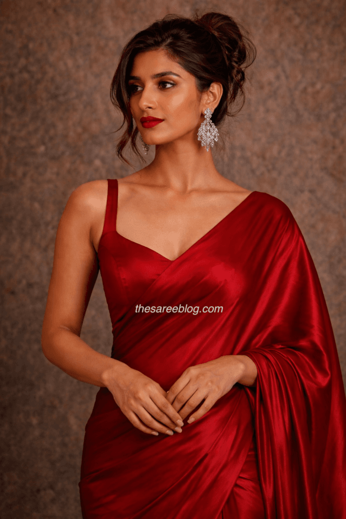
Red Saree Look Rule 3: Do Not Over-Highlight the Face
Red already lights up the room. Excess glow on the face competes with the saree and creates imbalance. Metallic highlighter, glossy base, glitter eyeshadow, and excessive shine fight with red instead of supporting it.
The flash photography problem
Under camera flash, glow makeup combined with red fabric produces harsh reflection. The face looks oily and the saree looks louder than intended.
The correct balance
Red prefers matte or satin skin with controlled structure. Glow should whisper, not scream. A bold lip must be paired with a soft eye, and a smokey eye must be balanced with a neutral lip. Red already carries colour weight, so the face must not try to overpower it.
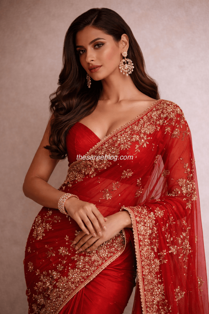
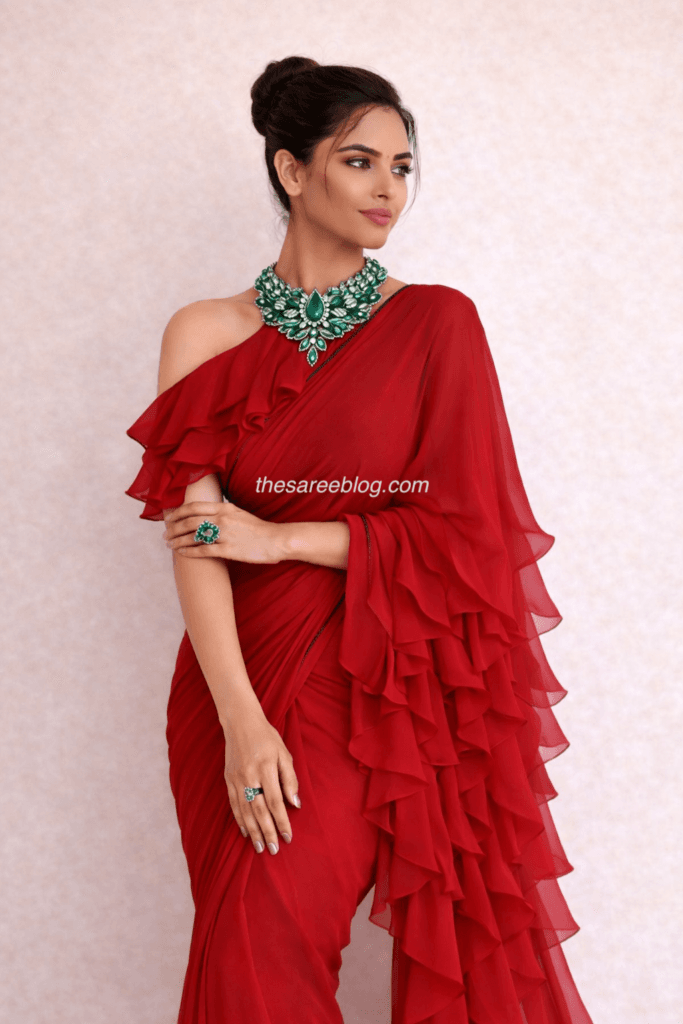
Red Saree Look Rule 4: Do Not Mix Jewellery Metals
Metal consistency matters more with red than with any other colour. Red amplifies clashing metals and exposes inconsistency instantly.
The confusion effect
Gold mixed with silver, rose gold mixed with antique tones, or diamonds paired with oxidised jewellery break visual harmony. This is not fusion styling. It is confusion.
The metal rule
Warm reds respond best to gold. Cooler reds pair better with silver or diamonds. Rustic handloom reds suit antique or oxidised finishes. Red respects consistency and punishes randomness.
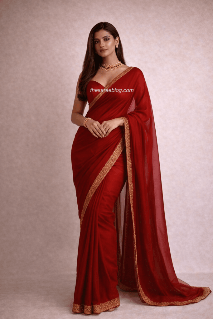
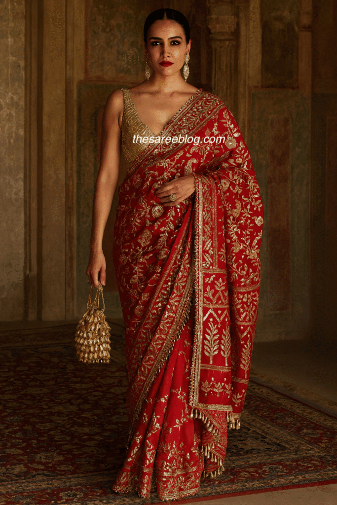
Red Saree Look Rule 5: Do Not Ignore Fabric Weight
A heavy red saree demands posture and discipline. If the fabric is rich but styling is casual, the authority of the garment collapses.
Common fabric mistakes
Slouching in silk, messy pleats in brocade, casual draping of ceremonial weaves, and loose tailoring all weaken the look. Red exposes laziness faster than softer colours.
Structural requirement
Structured pleats, clean pallu lines, and a tailored blouse are not optional details. They are architecture. The saree must look intentional, not thrown together.
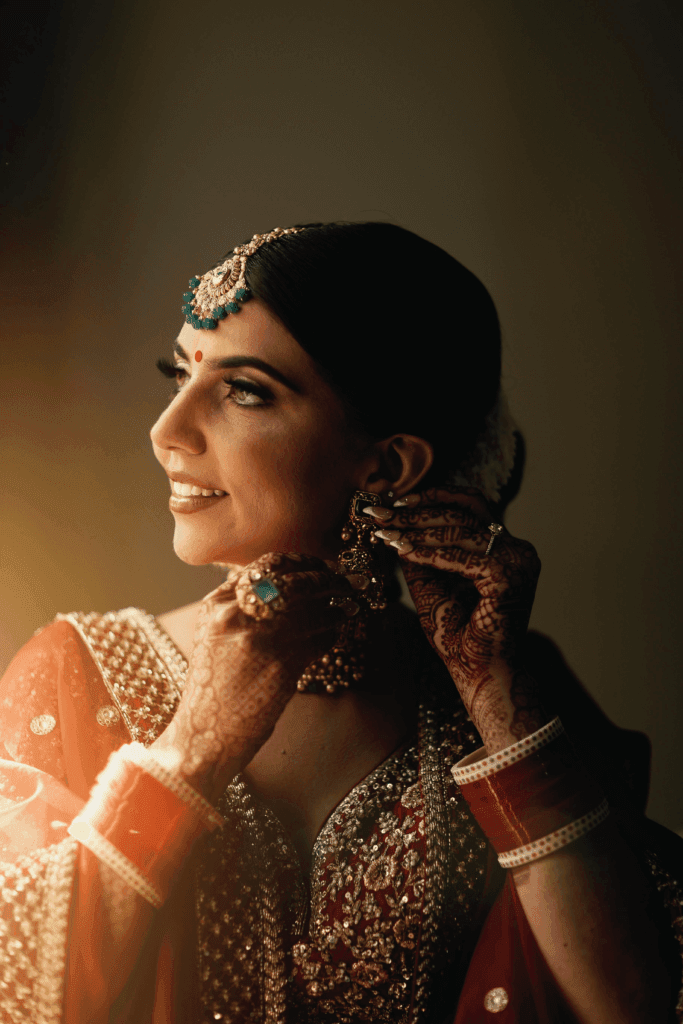
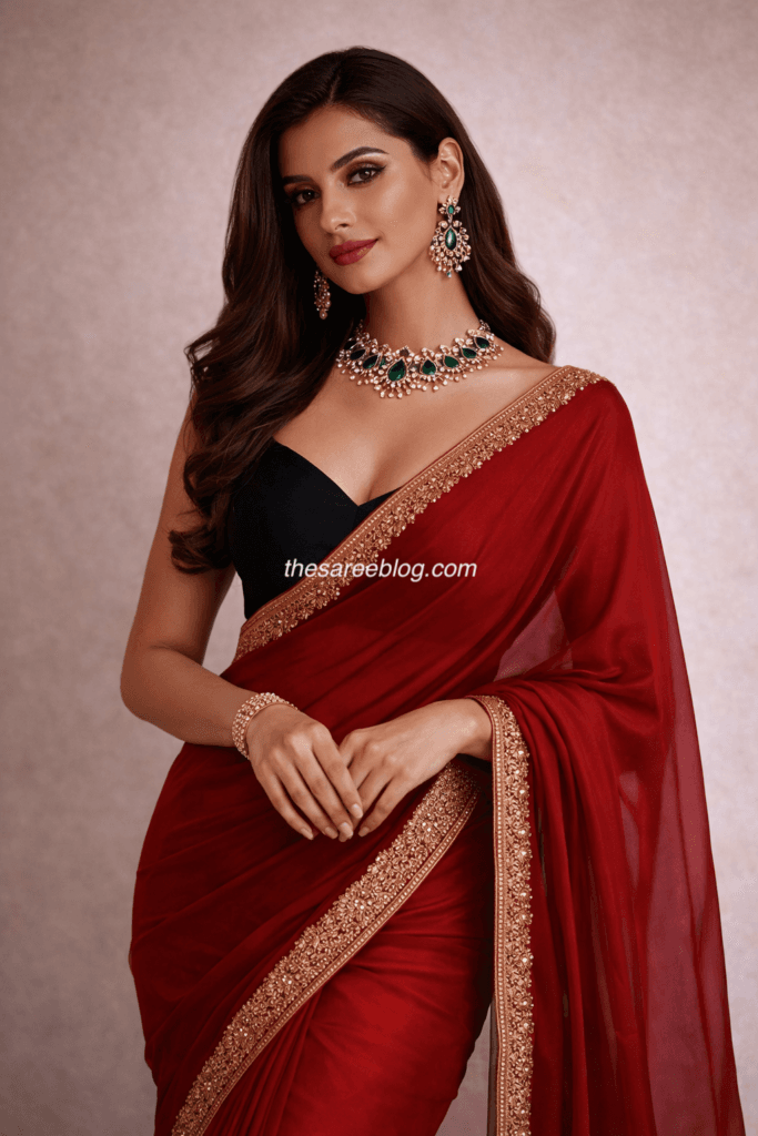
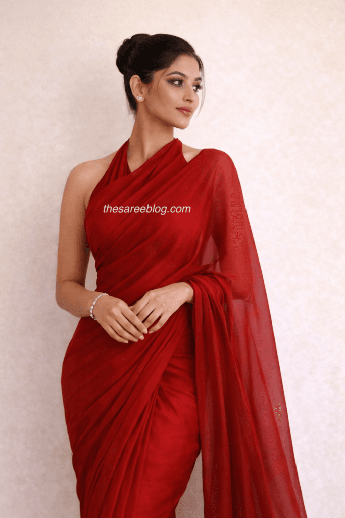
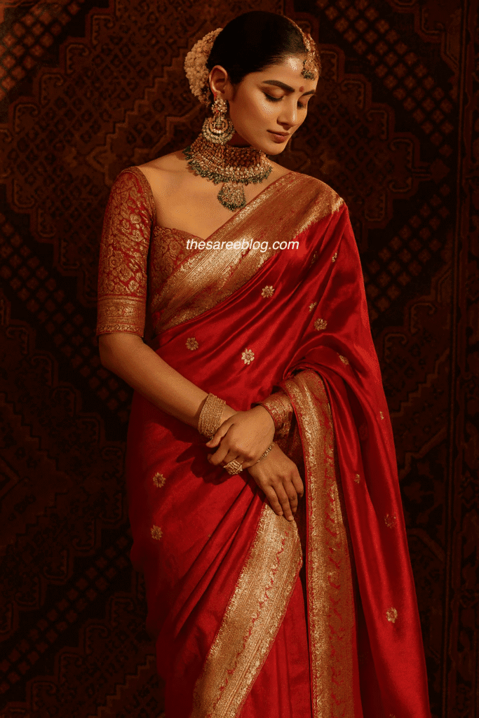
Red Saree Look Rule 6: Do Not Choose a Weak Blouse
The blouse is the backbone of the saree. A weak blouse destroys even the finest red drape.
Tailoring errors red exposes
Ill-fitted sleeves, gaping armholes, wrinkled fabric, and poor lining become magnified under red. These flaws cannot hide.
The blouse principle
The blouse must sit flat on the shoulders, hug the torso cleanly, and support the drape. Decoration cannot compensate for bad tailoring. A simple perfect blouse is always stronger than an elaborate flawed one.
Red Saree Look Rule 7: Do Not Add Excess Colour
Red does not like crowded palettes. Every extra colour reduces authority.
What excess colour looks like
Multicolour bangles, rainbow embroidery, bright footwear, and competing accessories pull attention away from the saree. The outfit begins to look theatrical instead of elegant.
Controlled palette strategy
Red works best with gold, nude, black, ivory, or one deep jewel tone. Anything beyond this becomes costume.
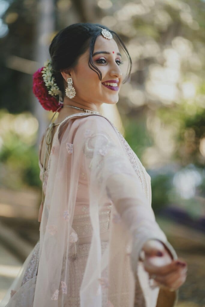
Red Saree Look Rule 8: Do Not Over-Accessorize the Hair
Hair styling should frame red, not fight it. Decorative clips, flowers, pins, glitter spray, and exaggerated curls layered together create visual noise.
Balance between hair and jewellery
When jewellery is strong, hair must simplify. When hair is elaborate, jewellery must edit down. Elegance requires breathing space around red.
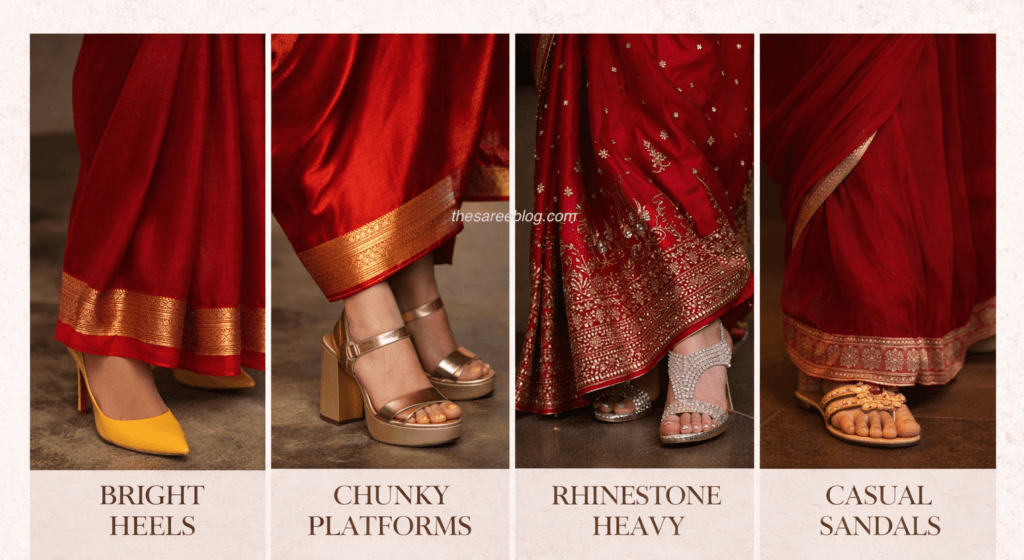
Red Saree Look Rule 9: Do Not Ignore Footwear Logic
Shoes are support actors, not co-stars. If footwear draws attention first, styling has failed.
Footwear mistakes
Bright heels, chunky platforms with silk sarees, rhinestone overload, and casual sandals paired with formal red break visual harmony.
Correct footwear direction
Nude, gold, transparent heels, or classic juttis extend the saree mood without competing with it.
Red Saree Look Rule 10: Do Not Copy Bridal Styling Everywhere
Not every red saree moment is a wedding. Over-bridal styling outside bridal context looks theatrical.
Context mismatch
Temple jewellery at dinner events, bridal maang tikka at casual gatherings, and layered gold sets with minimal sarees distort proportion.
Environment rule
A red saree must match the room it enters. Styling is a conversation with context.
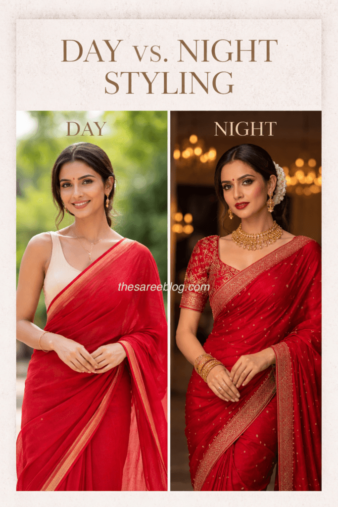
Red Saree Look Rule 11: Do Not Ignore Fabric and Occasion Alignment
Fabric determines tone. A saree that is too heavy for the event feels overdressed. A saree that is too light feels incomplete.
Day versus night logic
Daytime red prefers lighter weaves and softer textures. Night red requires depth, shine, and richer surfaces. Lighting is part of styling.
Red Saree Look Rule 12: Do Not Forget Body Proportion
Red exaggerates silhouette. Wrong drape or blouse length becomes more visible.
Proportion errors
Wide pleats add bulk, cropped blouses cut the torso awkwardly, oversized sleeves shorten the arms, and fragile narrow pallus weaken the frame.
Structural balance
Red demands architectural proportion. Every line must feel intentional.
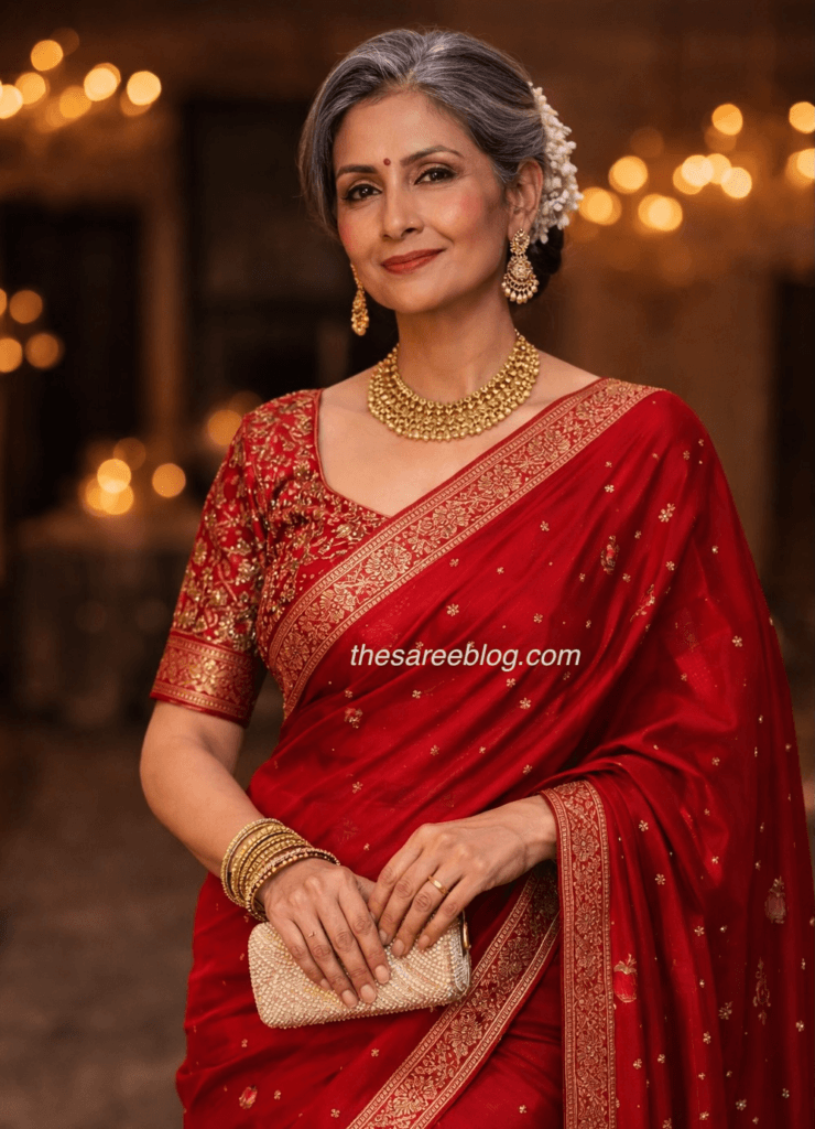
Red Saree Look Rule 13: Do Not Believe Age Myths About Red
Red is not too young or too bold for any age. The problem is not age. The problem is styling.
The truth about elegance
Over-glam red looks forced at any age. Under-styled red looks unfinished at any age. Fabric choice, tailoring, and restraint determine sophistication.
Final Philosophy: Red Is About Control
Red is not decoration. Red is control. The strongest red saree looks are not the richest. They are the most edited. The wearer should look composed, not overloaded. Think gallery display, not festival stall. Every element must justify its presence. If something is not adding clarity, remove it.
The final rule
Before stepping out, remove one accessory. One bangle stack, one jewellery layer, one hair element, or one makeup intensity. The difference between regal and excessive is often one extra decision. Red rewards restraint more than addition.
Closing Note
A red saree is not styled. It is curated. It demands discipline, precision, and respect for balance. When edited properly, it becomes timeless. When overloaded, it becomes costume. This rule book exists to protect red from excess. Red does not need help to be powerful. It only needs space.